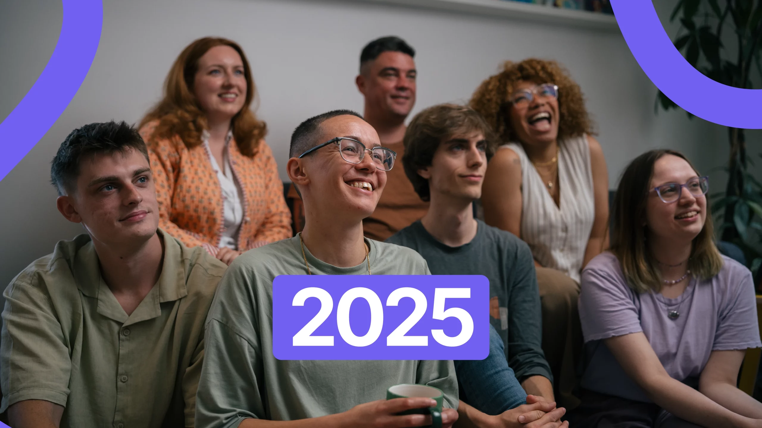
As we reach the end of 2025, I always find it useful to pause.
Not to predict the future or chase trends for the sake of it, but to reflect on what we have collectively been building, questioning, celebrating and sometimes pushing back against. Words of the year, colours of the year and trend forecasts are only interesting when they help us understand how people are feeling and how that shows up in technology and design.
Over the past few weeks, I have been sharing reflections on some of the most talked-about ideas in tech and UX this year. This post brings those thoughts together, not as a definitive list, but as signals worth paying attention to as we move into 2026.

Vibe Coding and the Rise of AI Assisted Creation
Collins’ Word of the Year for 2025 was “vibe coding”.
Coined by AI pioneer Andrej Karpathy, vibe coding describes using natural language to get AI to write code for you. Instead of carefully crafting every line, you describe what you want and let the machine generate the output. Programming by vibes rather than variables.
The reason this term spread so quickly is because it captures something much bigger than coding. It reflects a wider shift towards AI assisted everything.
I do not see vibe coding replacing developers any time soon. What I do see is its usefulness for founders and early-stage thinkers who want to explore ideas, structure their thoughts and understand the scale of what they are trying to build before speaking to specialists.
In some cases, this is genuinely helpful. When someone tries to build something themselves, even roughly, they often gain a new appreciation for the complexity involved and the value of skilled, thoughtful work.
As Carl Brown puts it:
“It makes the easy stuff easier and the hard stuff harder”
Where things get tricky is when speed becomes the expectation. AI can move quickly, but real products still require planning, analysis, consultation, design decisions and testing. That work does not disappear just because a prototype appeared faster.
Vibe coding is a sketchpad. Not a shortcut to quality.
Colour of the Year: When Context Is Everything
Pantone’s Colour of the Year for 2026, Cloud Dancer, sparked more debate than delight.
Described as a soft, airy white symbolising calm and clarity, the reaction online was largely critical. Many people found it overly safe, colourless or even tone deaf given the cultural moment we are in.
What interested me most was how quickly the conversation moved beyond aesthetics. Choosing a near-white colour right now carries symbolic weight. For some, it felt less like serenity and more like avoidance or erasure.
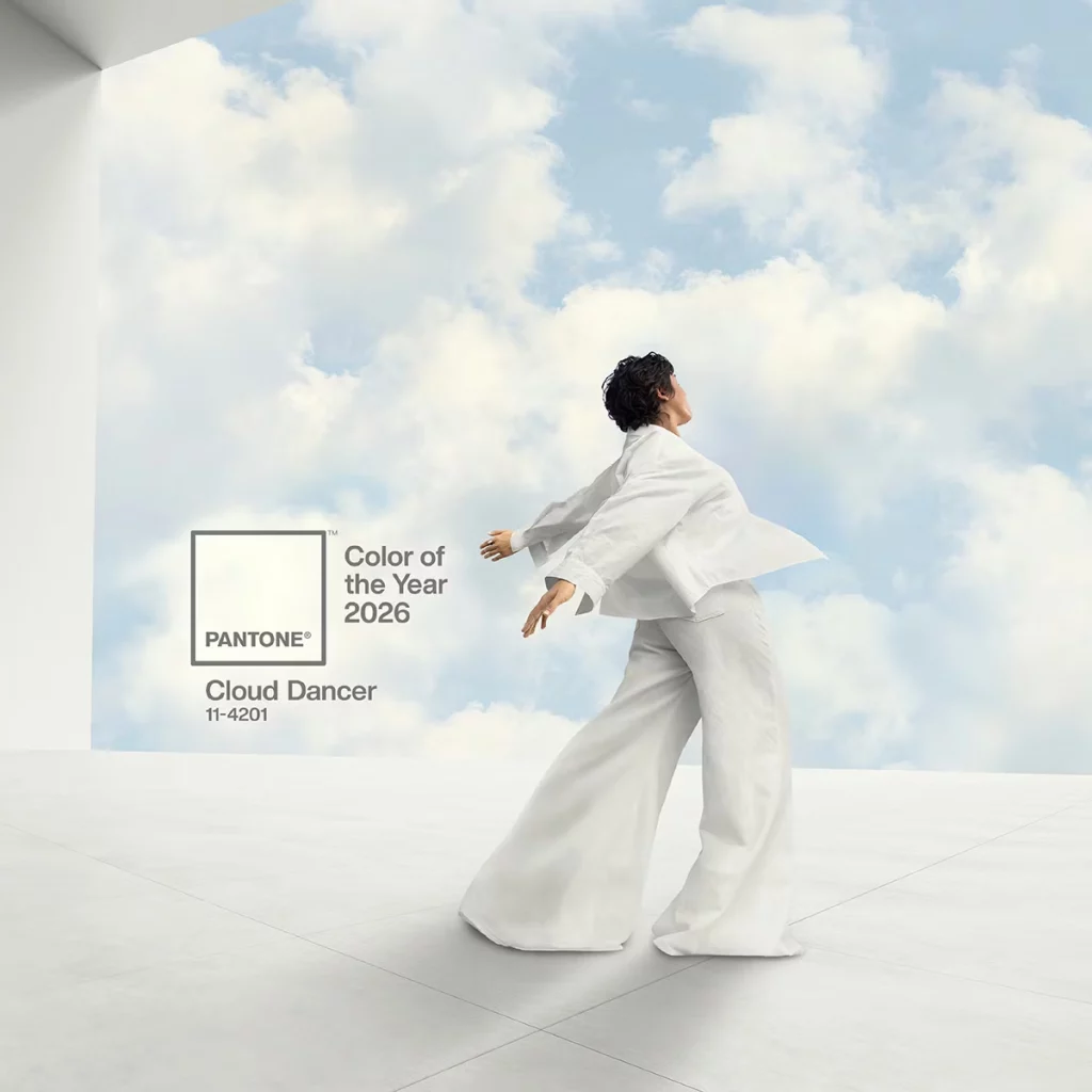
Design-wise, what seems like an attempt at quiet minimalism feels more like creative withdrawal. In a moment when many interiors and brands are gravitating toward grounded, earthy palettes, rich textures and our internet is getting filled by the AI Purple, “Cloud Dancer” reads as overly safe and boring.
This raises a bigger question for anyone working in product or branding. Are we trying to reflect what people are feeling, or are we trying to tell them how to feel?
UI and UX in 2025: What Actually Showed Up
I find UI and UX trend lists fascinating, but mostly because I like to ask whether we actually remember them when designing.
Looking back at predicted trends for 2025, some quietly shaped the work we saw, while others barely made a dent.
We did see:
- Grain, blur and glow effects are appearing more frequently
- Motion and microinteractions are being used more intentionally to guide users rather than distract them
- Continued improvement in UX writing, particularly in mature products like Monzo, Duolingo and Headspace
- Biometric and silent authentication are becoming a baseline expectation
- A stronger conversation around ethical, accessible and sustainable design, even if practice has not yet fully caught up with intention
What we did not see was a wholesale adoption of some of the louder visual trends that dominated predictions. Which reinforces something I believe strongly. Trends seep in slowly. They influence our collective subconscious rather than arriving fully formed.
Looking Ahead to 2026: Signals, Not Certainties
Predictions for 2026 lean heavily towards adaptation and restraint.
- AI driven experiences: Interfaces adapting moment by moment to context, behaviour and emotional cues
- Multimodal interaction: Smooth switching between voice, gesture, touch and even eye tracking
- Spatial computing: Designing beyond the screen with AR, VR and mixed reality becoming more mainstream
- Zero UI: More tasks handled quietly in the background through automation
- Digital wellbeing: Products built to support calmer use patterns and healthier habits (yes please!)
- Accessibility as a core requirement: Far less optional, with regulation and expectation driving it forward (amazing!!)
- Functional minimalism: Even more clarity, less clutter and animations that have a clear purpose
- Liquid, organic aesthetics: Softer gradients, fluid forms and more human warmth in visual design
- Sustainable UX: Lighter UIs, optimised assets and performance first design to reduce digital carbon impact
What stands out to me is the mention of more sustainability, and accessibility. I am yet to see this big shift, but I’ll take it!!
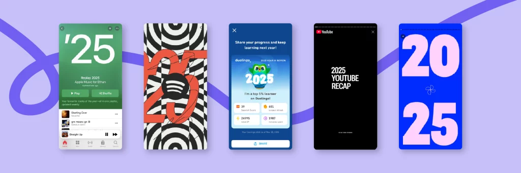
The Wrapped Trend and Why User-Generated Data Matters
If there is one UX pattern that truly peaked in 2025, it is the “wrapped” trend.
What started with Spotify has expanded everywhere. Apple Music, YouTube, Monzo, Duolingo and even AI tools now generate personal summaries of usage and behaviour.
This works because it centres the user, not the product.
Why?
• People enjoy seeing themselves reflected in ways that feel personal. It is essentially “here’s who you were this year”.
• People love a reward without effort. And this feels like a reward and acknowledgement for using the app.
• People love the data that’s translated into something meaningful, emotional, funny, personal and often surprisingly accurate.
• People love sharable content, but in a way that centres self expression rather than the product itself. This trend is a great opportunity for content.
So what does this tell us?
• User generated data is one of the most valuable way that companies can derive data.
• Data becomes emotional when it helps people reflect, not when it feels like they are being measured.
• Feedback loops matter more than ever.
• Personalisation is everything. And I see it less about “we know you” and more about “we are helping you make sense of yourself”. It’s a trade-off, right?
• Most importantly when people understand themselves better through your product. They connect and stay. They become ambassadors not just users.
Since posting about this on Linkedin, I saw a couple of people ranting about how “not every product needs a wrapped”. I love a “wrapped”, but I guess it also needs to be meaningful to the user. Which side are you on?
Other Cultural Signals Worth Noticing
Absurdity as Signal, Not Noise
One of the quieter but more telling cultural shifts of 2025 was the rise of absurdity and randomness in online content. Viral moments increasingly arrived untethered from clear meaning or message, relying instead on repetition, irony and shared recognition. They did not ask to be understood. They asked to be noticed.
This was not silliness for its own sake. It felt more like a response to cognitive overload, constant optimisation and the pressure to perform expertise online. In a digital environment saturated with opinion, context and polish, nonsense became a form of relief. Participation no longer required explanation or commitment, only recognition. You either got it, or you did not, and that was enough.

What is interesting here is not the content itself, but what it reveals about how people are feeling. There is a growing fatigue with systems that demand attention, comprehension and constant decision-making. Interfaces that ask users to optimise, personalise, compare or justify every action are becoming emotionally heavy. Absurdity works because it removes the burden of interpretation and lowers the stakes of engagement. It allows people to exist in digital spaces without needing to perform or explain themselves.
For UX and tech, this shift is worth paying close attention to. Users are gravitating towards experiences that feel lighter, less didactic and more permissive of play. This does not mean people want products to be meaningless or chaotic. It means they want moments of relief within systems that often feel relentless.
As we look ahead, the challenge for designers and technologists is not to imitate randomness or chase internet humour. It is to understand what this behaviour signals. People are craving interfaces and products that feel human, forgiving and emotionally breathable, rather than relentlessly efficient.
Sometimes the most important insight is not what users are saying, but what they are escaping.
Trends are not instructions. They are reflections.
What 2025 has shown me is a clear desire for technology that feels more human, more intentional and more respectful of people’s time, energy and attention.
As we move into 2026, the challenge is not to chase what is new, but to design what is necessary.
That is where good UX lives.