We’ve been working on an app to change the housing sector, and we can’t wait to tell you all about it, we finally feel like it’s ready for the world to know!
How it all began
When our investors approached us with the idea of an app that could reward tenants for their engagement, we knew it was going to be big. Nobody was (or is) doing a reward system in the way they we’re imagining in this sector. The idea was as challenging as it was exciting.
But we knew rewards couldn’t be the only thing we offered. We needed to understand how this product could genuinely help people improve their lives while also rewarding them. It was important to stay grounded in their very human, everyday problems before offering gifts.
Validation first!
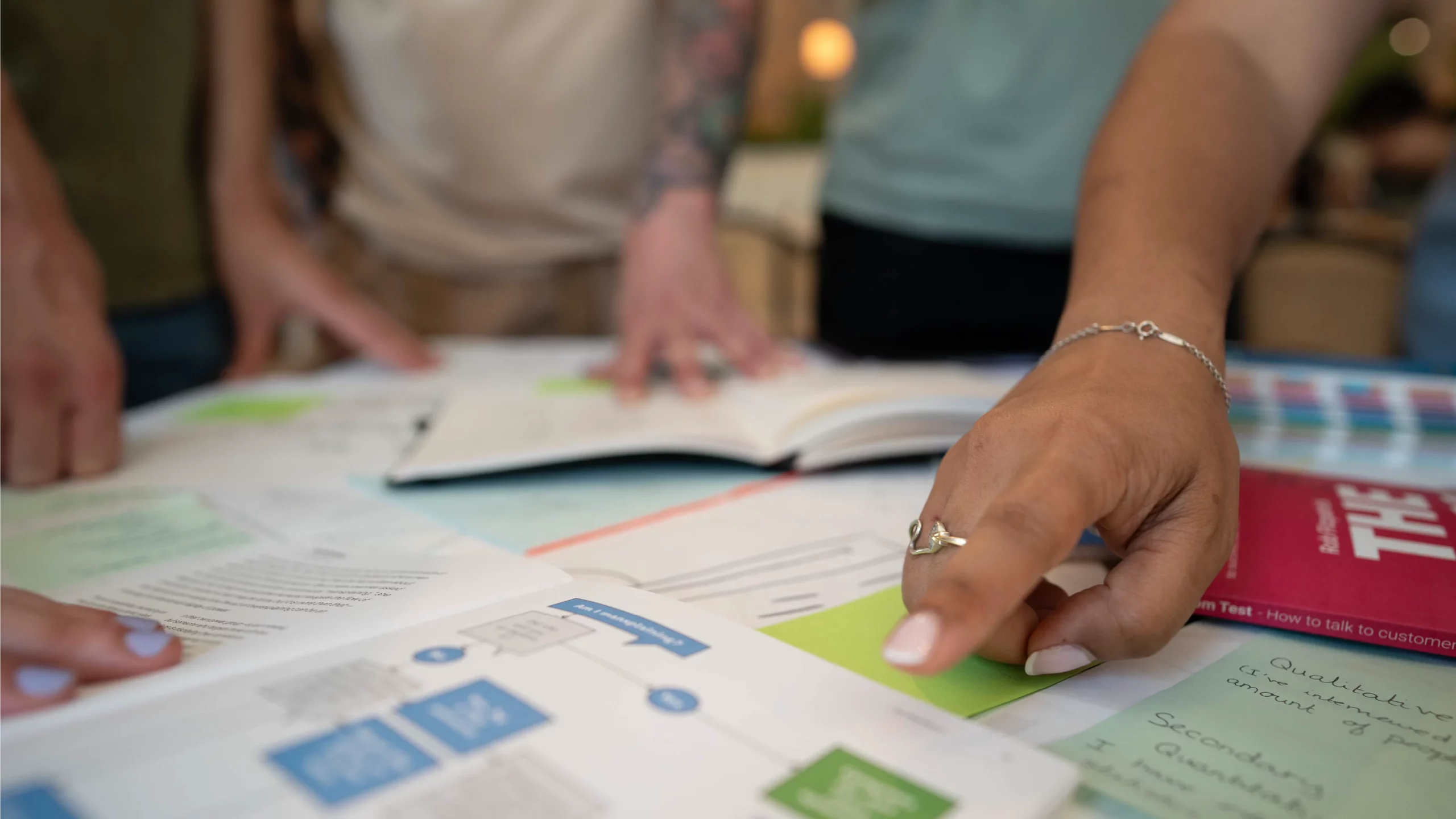
We jumped straight into our validation process. We started speaking to housing associations. We also learned a lot from our investor Stewart, who’s spent over two decades helping housing providers improve energy efficiency, and saw first-hand how poor communication slows down repairs and drives up costs.
And of course, there’s David Jones – father of one of the biggest games of our time – who understands how gamification works and the value of creating delightful, fun experiences through digital products.
Talking to people in the sector wasn’t enough. We reached out to contractors, which validated the problem at hand: communication between all parties involved in the repair process is broken, and compliance is suffering as a result.
Last but not least, we spoke to social tenants. It’s crucial to understand the people who’ll be engaging with the product. We needed to go beyond assumptions the sector had made about why it’s so hard to get access into homes.
This is where we gained real insight that shaped how Gaffa works. Gaffa is now built on these foundations to make sure tenants feel seen, heard and respected. Our interviews gave us the golden insight: people just want to be cared for and prioritised.
We heard horrific (more like non-) repair stories. We heard gratefulness in the midst of difficult conditions. We heard patience, complaints, annoyance…
It was so good to be able to spend time with Gaffa’s target audience, because now we have a little insight into their lives and needs, and, most importantly, a better idea of how our product can help them.
The problem at hand became clearer
For many tenants, reporting a repair is stressful and unclear. Access is hard to arrange. Explaining issues is difficult — let alone proving they exist in the first place — and updates are either non-existent or too infrequent.
On the other side, repair teams waste time on unnecessary visits due to vague explanations, missed appointments, and endless back-and-forth between contractors and tenants. Miscommunication is expensive, breaks trust, and in some cases, affects compliance and regulatory requirements.
In summary, we validated these core assumptions:
- Tenants want to do the right thing — if the process is clear
- Repairs teams are frustrated by poor data and wasted visits
- Repairs need more data to trigger the right process
- Tenants often feel disrespected, especially since many are already living under challenging circumstances (long-term illnesses, being a carer, neurodivergence, mental health conditions, immigration barriers…)
We can finally start designing
This is the fun bit, where the design team finally gets to turn all that data into a creative solution and bring it to life with colour, personality, and purpose.
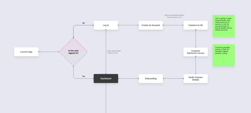
At this point, branding and UX go hand in hand. While we were working on user flows and wireframes, we also began the branding process.
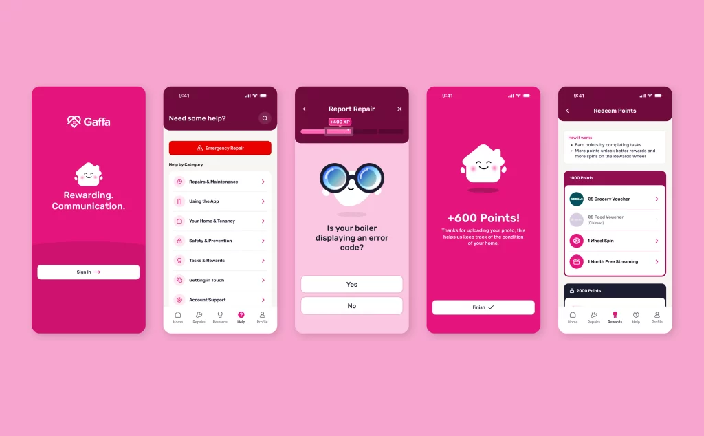
1. UX Strategy
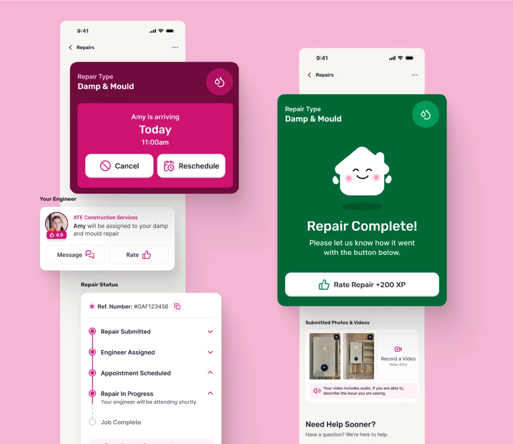
We mapped the tenant’s emotional journey, from “something’s broken” to “someone’s coming to fix it.” This helped us identify key UX moments where anxiety peaks, where control is lost, and where communication typically breaks down.
Key UX choices included:
- A repair reporting process that’s simple but thorough, with questions not just about the repair, but about tenant preferences and requirements
- Progress tracking so tenants know what’s happening
- Video and image diagnostics to reduce unnecessary visits
- Chat between tenants and engineers to stay in touch about availability or requests for more info
- DIY resources and FAQs to help tenants where possible
- Surveys to support continuous feedback and compliance
- A tone of voice that’s warm, human and non-punitive
2. Gamification
Rather than building a flashy point system, we focused on meaningful micro-rewards:
- Tenants earn points for actions that support resolution (e.g. uploading a photo, allowing access, giving feedback)
- Points unlock small but real-world rewards (like coffee vouchers or grocery discounts)
- Badges act as gentle nudges to guide desired behaviour (e.g. “First Fix Hero” for enabling a first-time repair)
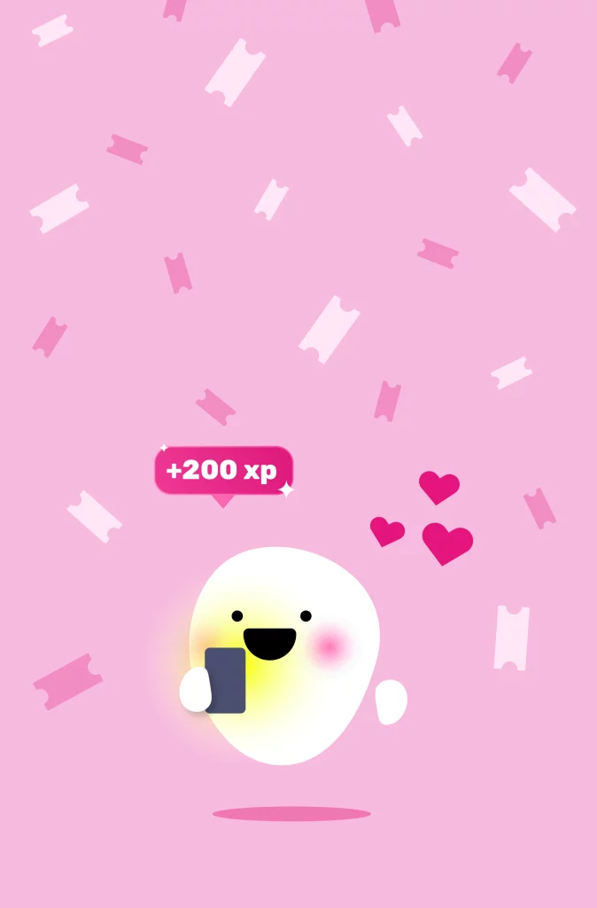
- Friendly tips, notifications and celebrations from our mascot
This wasn’t about making repairs fun, because let’s face it, they’re not! It was about recognising effort, restoring dignity, and encouraging mutual accountability.
Branding
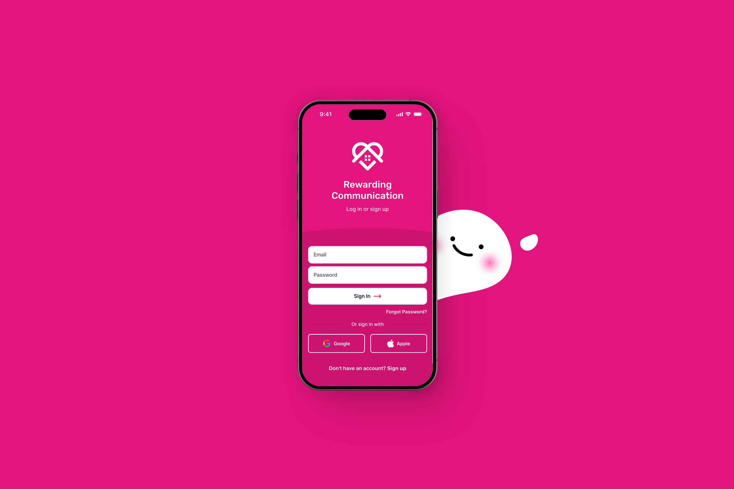
Following our research and validation, our focus became creating a brand that felt trustworthy, supportive and easy to engage with. Something that would stand out in a sector dominated by cold blues and corporate tones.
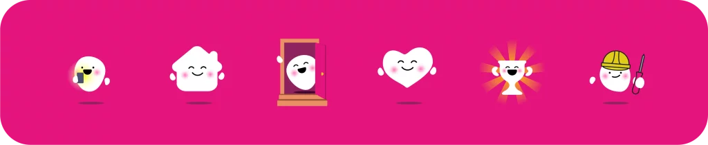
We developed a full visual identity and logo system, brought to life through a custom-designed mascot: Bobbi.
Introducing Bobbi
We wanted to create a mascot because, well we needed to make this communication a little cuter. We wanted to give it a face, a way of conveying feelings.
After going through many ridiculously cute designs, we settled on a blob. Why a blob? Because it’s neutral, easy on the eye and honestly, who can hate a blob, especially one that changes shape?
Think about some of the most memorable digital products you interact with — they have a mascot. Sometimes, you’ve just got to look around and learn from others. That definitely influenced our decision here.
So, back to Bobbi.
Bobbi is designed to be expressive and abstract, often taking on forms like a heart, lightbulb or house to convey messages in a playful, emotive way. He brings warmth and playfulness to every brand touchpoint.
Colours & Typography
This part came naturally because by now, we knew exactly how we wanted our users to feel.
We chose a bright yet grounded colour palette to evoke optimism and stability. While the spaces feel vibrant, they also carry a reassuring sense of permanence.
Our choices were guided by three main areas:
- The app (for tenants)
- The website (for interested parties)
- Corporate communications
Choosing pink as our primary brand colour was bold but intentional. We wanted to stand out, feel more human, and add some character and charm in a very formal industry.
For type, we selected Rubik, a soft yet accessible rounded sans serif. It enhances readability and approachability, making our tone feel friendly and non-intimidating.
Now we’re ready for UI
We started designing the app interface, now that we had our palette, typeface and mascot ready.
We added extra screens to celebrate and encourage users for key actions, and even worked in some light animations. This is where Bobbi really came alive — the perfect little blob!
This is also where our rewards and XP system came together.
Feedback (So Far)
Gaffa is currently still in design and testing stage.
Early results from showcasing the app show:
- Tenants feel more in control when they can track updates and communicate directly
- Housing officers appreciate the gamified user journey and say it’s a huge improvement over the clunky systems tenants are used to
Our validation-first model saved time and focused our roadmap on what really mattered. Instead of chasing features, we anchored Gaffa in reality: designing for lived experience, not assumptions.
What We Learned
- Gamification works best when it respects the user. It’s not about points, it’s about partnership
- Simple UX choices like tone, clarity and transparency are more impactful than heavy functionality
- Validation doesn’t slow you down, it speeds up the path to relevance and helps surface challenges early, so you can invest in a smoother launch
Next Steps
We are planning our prototype testing with tenants, because we love to capture any UX issues before we start building the app.
We’re exploring partnerships with housing associations to learn from their systems and process and to eventually pilot Gaffa across real tenant groups, with built-in feedback loops for continuous improvement.
We are looking for contractors to learn from while we are designing the provider and contractor hubs as standalone products.